I picked a cute sketch and set to work. I've titled it "Vixens Never Retire". (Thanks for the suggestion Heidi!)
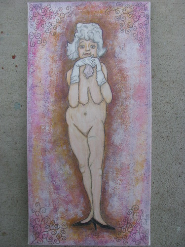

I'm super happy with the skin shading on the lady. I worked at it for ages even if it doesn't really show in this photo. In real life it stands out just like I hoped. I'm just not sure the background is "finished". As this isn't something I created I struggled a bit with a background style. It is water color crayon, acrylics, and graphite. Does it need a little something else, and if so what?
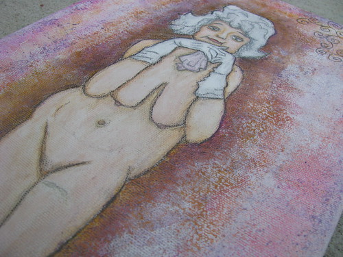

A close up for you to gander at too! I just thought this was such a whimsical and fun sketch I couldn't resist! Any feedback would be appreciated, but please be kind. I'm a bit out of my element here.


4 comments:
I think you did a great job with this fine dame. Her skin shading is gorgeous. I honestly think that the background looks good as it is. It is minimal, and makes the sexy septuagenarian the focus of the piece.
I think you did awesome with this little vixen! I love the idea of the piece, and I think that you did a perfect job on the background. It gives it some color, and offsets the gal, making her be the eye catching center of the piece! Good luck with the auction :)
I really like this. I think the background is good as is.
I like this piece a lot. It is amazing how you got that air of elegance around her although she is naked.
And the colors of the background are really well-chosen! :)
Post a Comment